Balancing and Improving Readability of Web Titles with react-wrap-balancer
- Published on
If you want to balance the width of each line of text in your React web page, making it visually more comfortable, you can use the react-wrap-balancer package to achieve the "Balance Text" effect.
I will tell you to the features and technical limitations of react-wrap-balancer, and teach you how to install and use it!
What is the issue with a normal article title?
When the text of a web page is too long, it will automatically wrap to the second or third line.
For example, the title of my article has three lines:
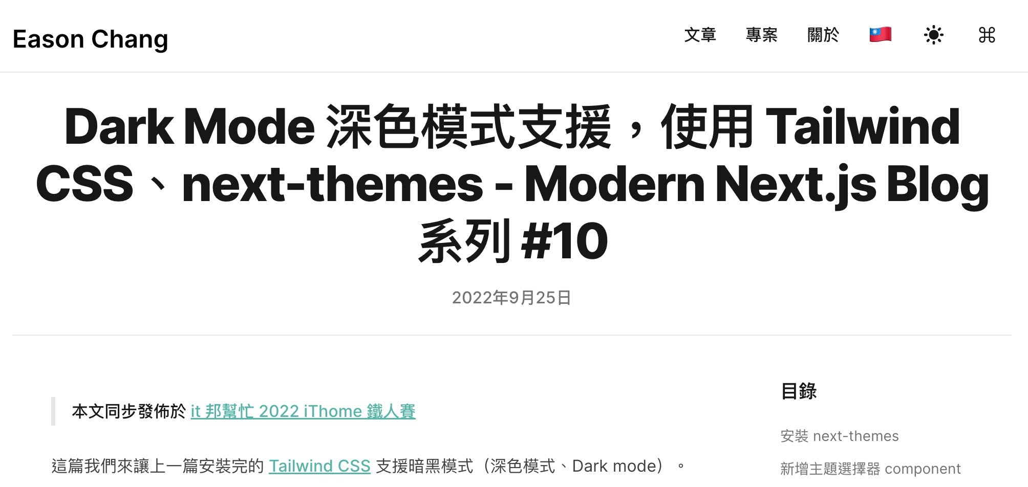
However, you will find that the third line only has 5 characters, which is visually very unbalanced compared to the first two lines.
At this point, you might instinctively want to modify the title by deleting some redundant words.
For example, after deleting the words "Dark Mode" the effect is as follows, looking much better:
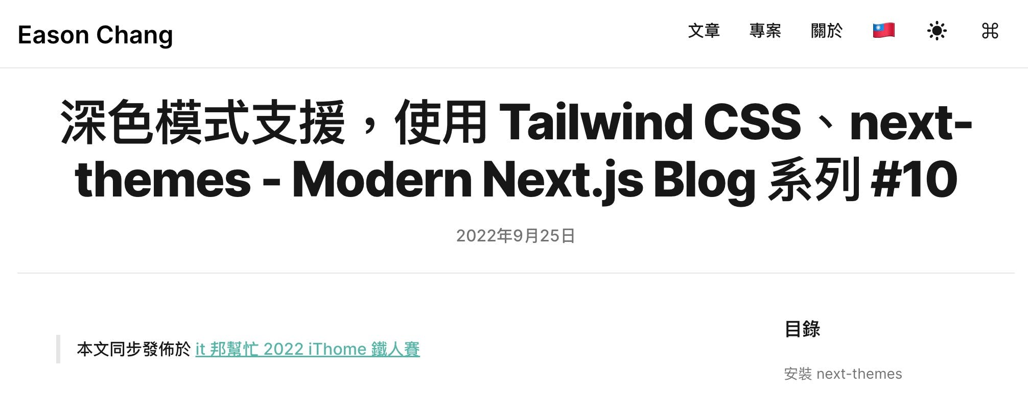
However, because web pages usually did RWD (responsive web design), the maximum width of the title is different when reading on different devices with different widths.
For example, when the reader uses a Surface Duo tablet (screen width of 540px) to read, the unbalanced third line appears again!
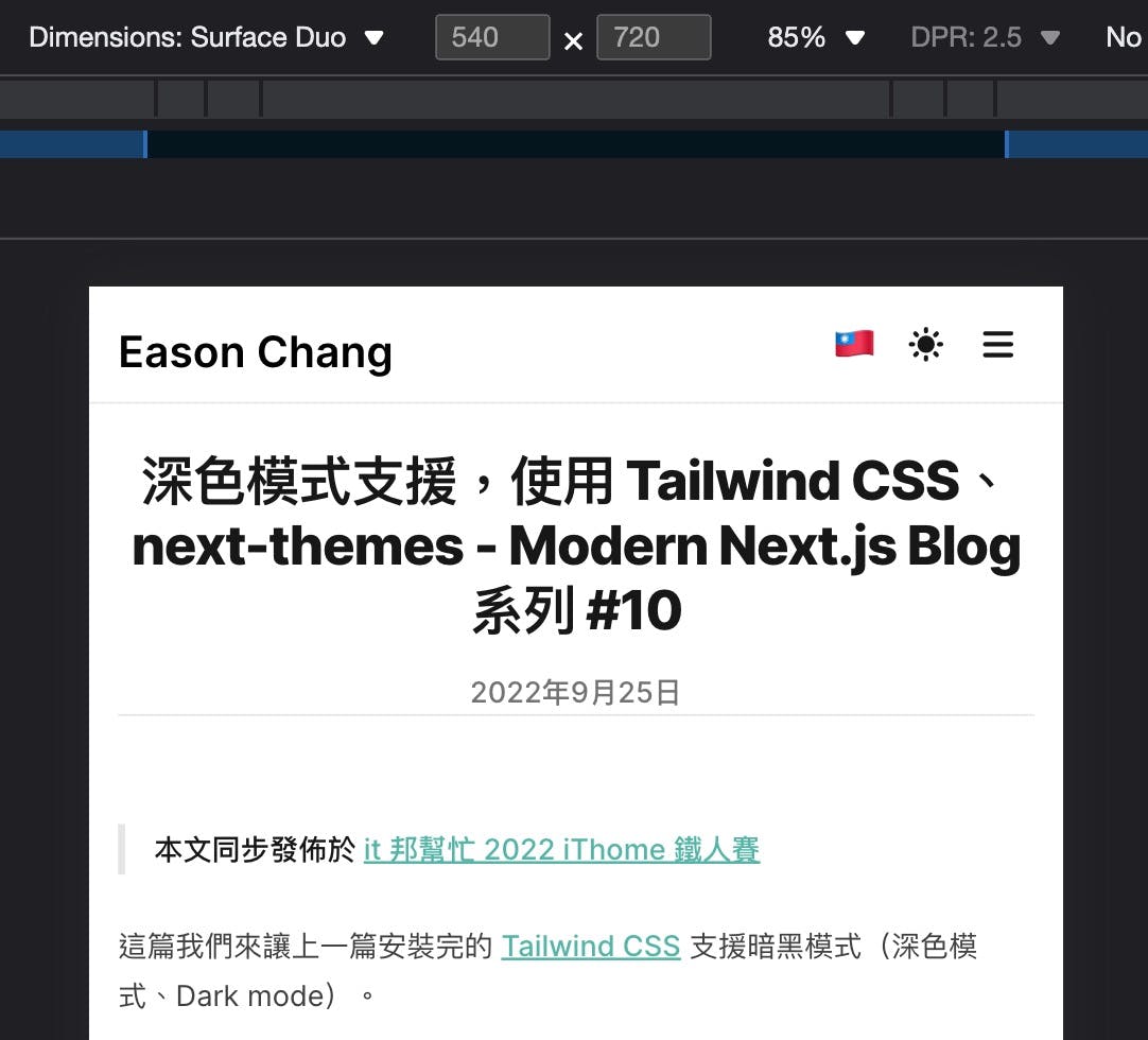
It's hard to rewrite the title to a perfect length that maintains visual balance in all cases, because there are too many possibilities for devices!
Since changing the content is not feasible, what can we do?
Balance Text
You can use the technique of Balance Text to dynamically adjust the width of the text block and balance the number of characters on each line.
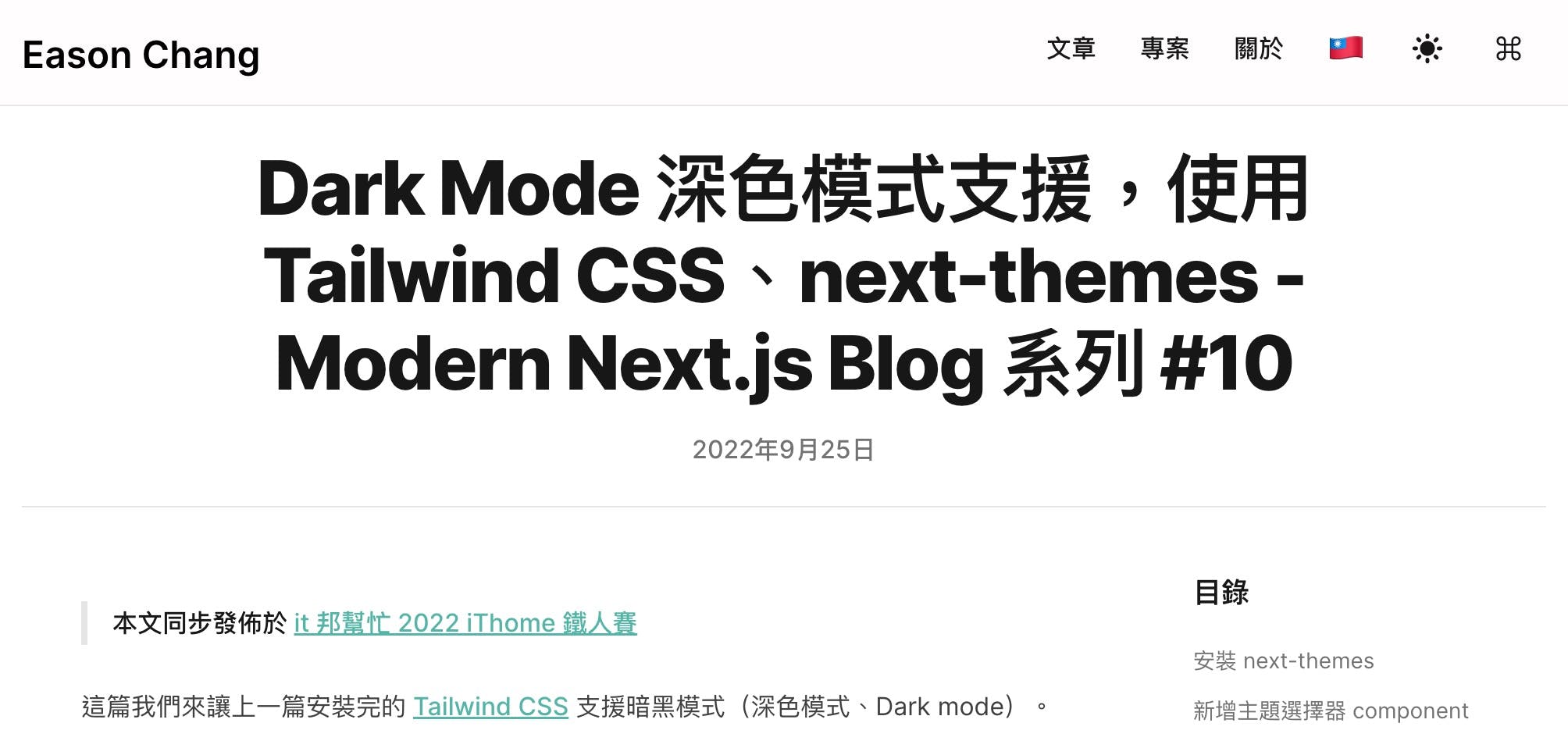
The effect after applying is shown below, the title is more balanced and easier to read!
Implementing balanced text in React with react-wrap-balancer
In a React.js project, you can use the react-wrap-balancer package to implement balanced text.
Links of react-wrap-balancer:
It has the following features:
- Extremely small bundle size, only 0.95 kB (Gzipped)
- Does not cause layout shifts (CLS) and does not harm SEO score
- Supports Server-Side Render, Next.js 13 app directory, and React Server Component
- Requires React ≥ 18.0.0 or later, and does not support IE 11
react-wrap-balancer Demo
There are several interactive demos on the react-wrap-balancer website, you can go there and try it out.
It is most suitable for use in titles, balancing the width of each line to make it more visually comfortable:

It can also be used in Chinese and other languages, and also supports left-aligned text:

In addition to titles, it is also suitable for use in Tooltip or Toast text:

Or you can apply it to entire paragraphs! It is very flexible to use:
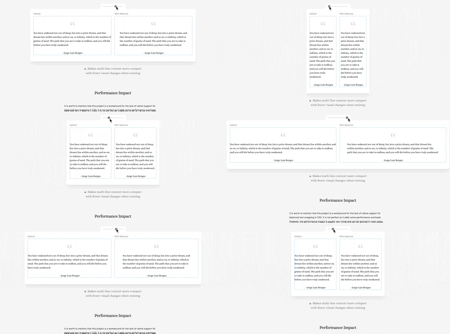
Install react-wrap-balancer
Installing react-wrap-balancer is very simple, just enter the command and install it using npm:
Copied!npm install react-wrap-balancer
Next, you can evaluate your scenario, whether you will display multiple balanced texts at the same time on the screen.
If so, it is recommended to use the <Provider> of react-wrap-balancer, wrapping the entire React App.
Although not necessary, doing so can improve overall performance and reduce HTML size.
If you are using Create-React-App, please modify App.js, and if you are using Next.js, please change it in _app.js:
Copied!import { Provider as ReactWrapBalancerProvider } from "react-wrap-balancer";

<ReactWrapBalancerProvider>
  <App />
</ReactWrapBalancerProvider>;
Use react-wrap-balancer
Assuming you want to apply it to the following React component:
Copied!export default function PageTitle({ children }) {
  return (
    <h1 className="md:leading-14 text-3xl font-extrabold leading-9 tracking-tight text-gray-900 transition-colors dark:text-gray-100 sm:text-4xl sm:leading-10 md:text-5xl">
      {children}
    </h1>
  );
}
Note:This is a simple
<h1>element with TailwindCSS that I actually use in my blog as post titles.
Just import the <Balancer> from react-wrap-balancer and wrap the text, and done:
Copied!import Balancer from "react-wrap-balancer";

export default function PageTitle({ children }) {
  return (
    <h1 className="md:leading-14 text-3xl font-extrabold leading-9 tracking-tight text-gray-900 transition-colors dark:text-gray-100 sm:text-4xl sm:leading-10 md:text-5xl">
      <Balancer>{children}</Balancer>
    </h1>
  );
}
The effect is as shown as following:

It's super easy to use!
Performance Evaluation
The more <Balancer> used in a screen, the more exponential the impact on performance will be.
This is because each time a <Balancer> is calculated, it may affect other <Balancer> and require recalculation.
The author's performance measurement results are shown in the following image:
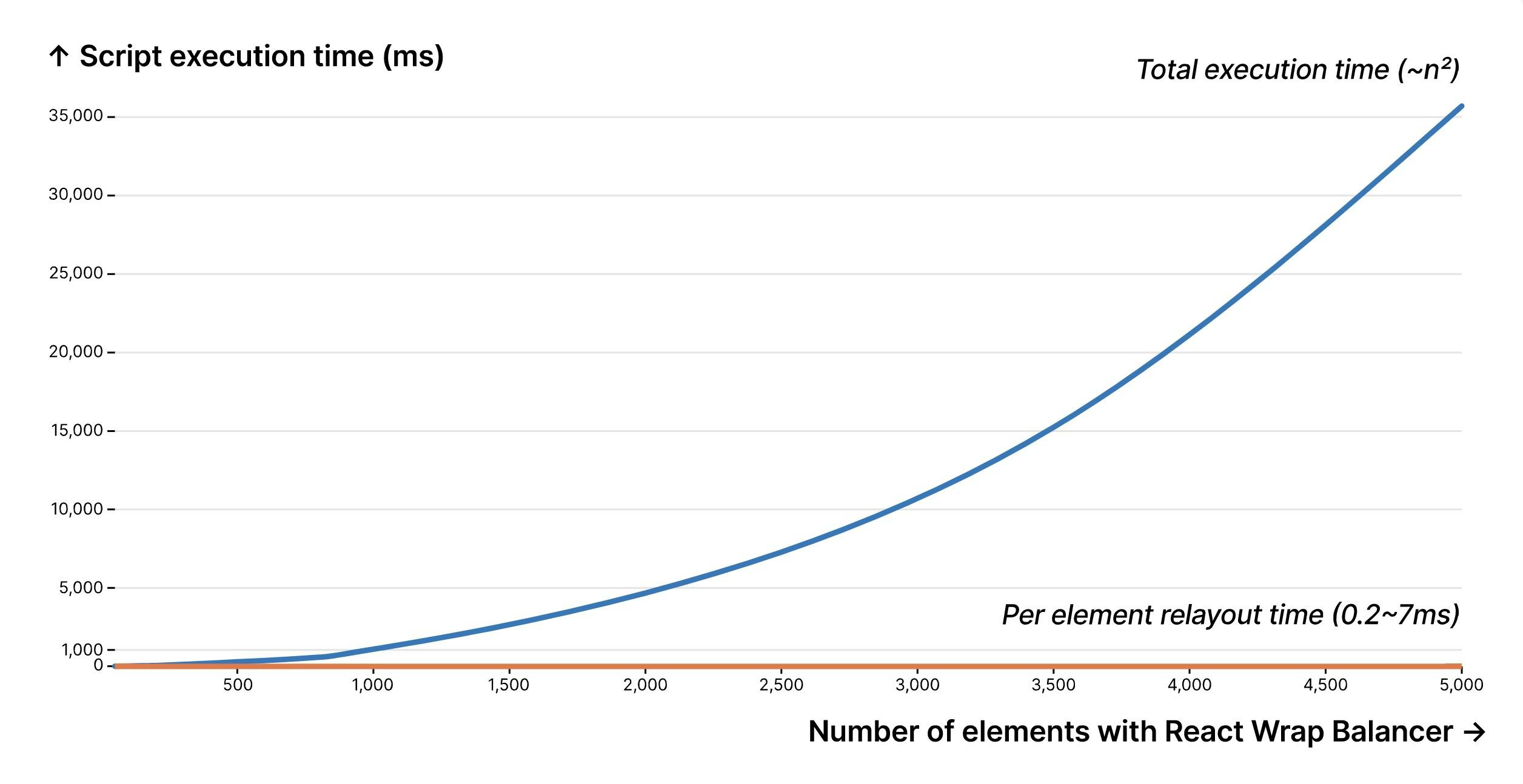
- When the page uses 100
<Balancer>, the total calculation time is approximately 0.025 seconds and there is no noticeable effect. - When used with 1000
<Balancer>, the total calculation time is approximately 1 second, which affects the rendering speed of the screen. - When used with 5000
<Balancer>, the total calculation time grows exponentially to 35 seconds, which is excessive.
Therefore, it is recommended to only use <Balancer> on elements that are truly needed, such as titles or elements that need user interaction to be displayed, such as tooltips.
Future Possibilities of "Balance Text"
Adobe and The New York Times also have similar projects implementing "Balance Text" effect:
There is currently a CSS proposal in progress, hoping to natively support this effect in CSS: https://drafts.csswg.org/css-text-4/#text-wrap。
Therefore, in the near future, when major browsers are supported, we can easily achieve the "Balance Text" effect using the following method:
Copied!.balance-text {
  text-wrap: balance;
}
Reference
The Gif animation and benchmark image in this article are taken from react-wrap-balancer Website。